
Rosenberg & Goldstein is a website project made to market a famous
regional law firm in the San Francisco Bay Area.
This project is designed with a classic and elegant theme that
creates a prestigious atmosphere for the visitor. Dark green
themed color is used to showcase professionalism and
trustworthiness to attract potential clients.
Rosenberg & Goldstein is consisted of a Landing Page, 3 Attorney
pages, 4 Services pages, and an About Us page. The landing page
includes sections such as Hero carousel, About Us timeline,
Accolades, Services, Attorneys, FAQ, Contact, and a Consultation
Request Form with a submission confirmation modal.
This is a mobile friendly website and employs responsive design.
Bootstrap and jQuery libraries have been used for light animations
and form validations to enhance user experience.
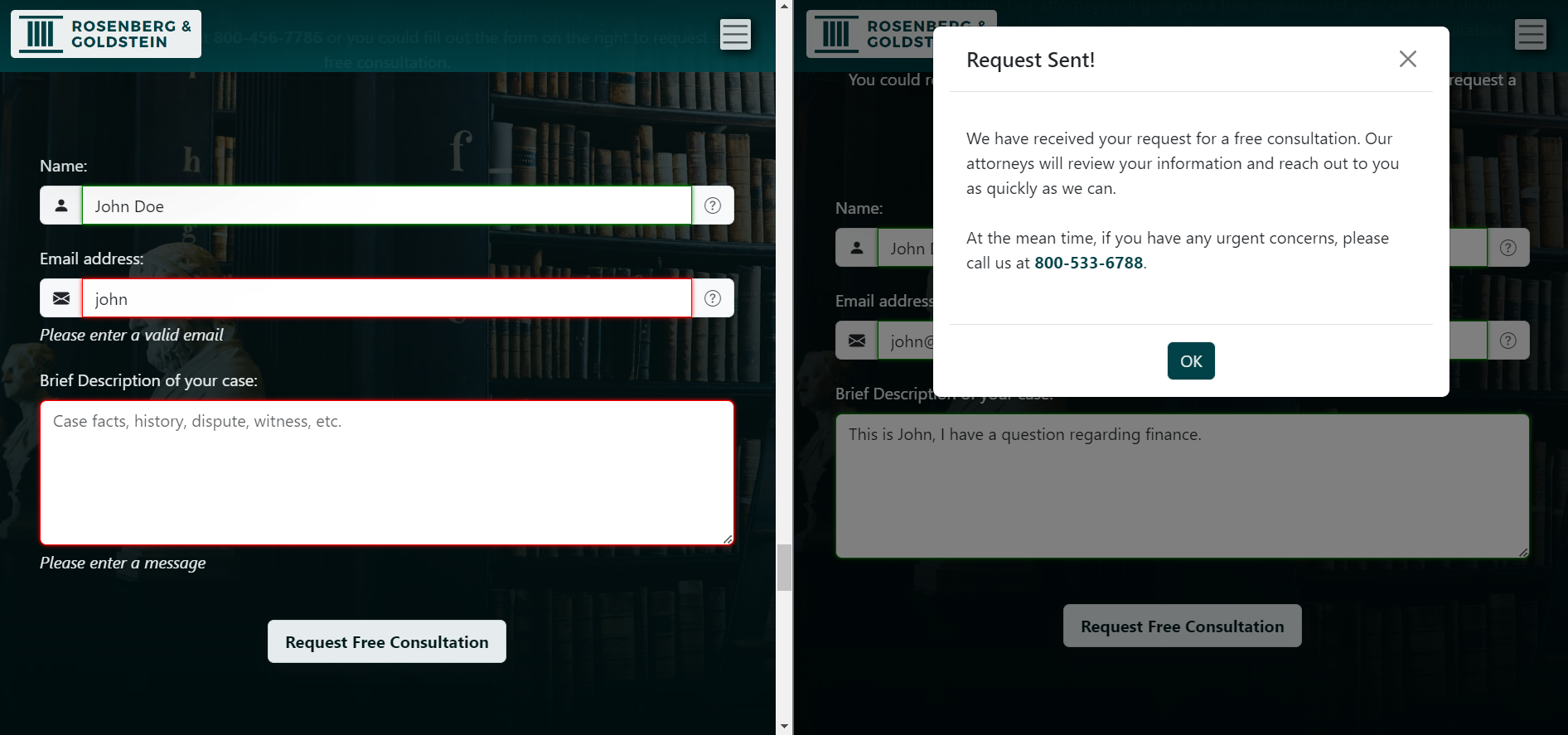
This form validates on both fast feedback and submit button
click. Fast feedback validation is triggered on blurring of the
inputs: as focus is lost, green border will appear for valid
input, and red border along with error message will appear for
invalid input. Upon submitting the form, inputs will be checked
again with the "Request Free Consultation" button click under
the same validation criteria.
The form will only
submit if all input fields are valid, a confirmation modal will
appear after submission and input fields will return to the
default state. jQuery and Javascript are used to implement this
form validation.
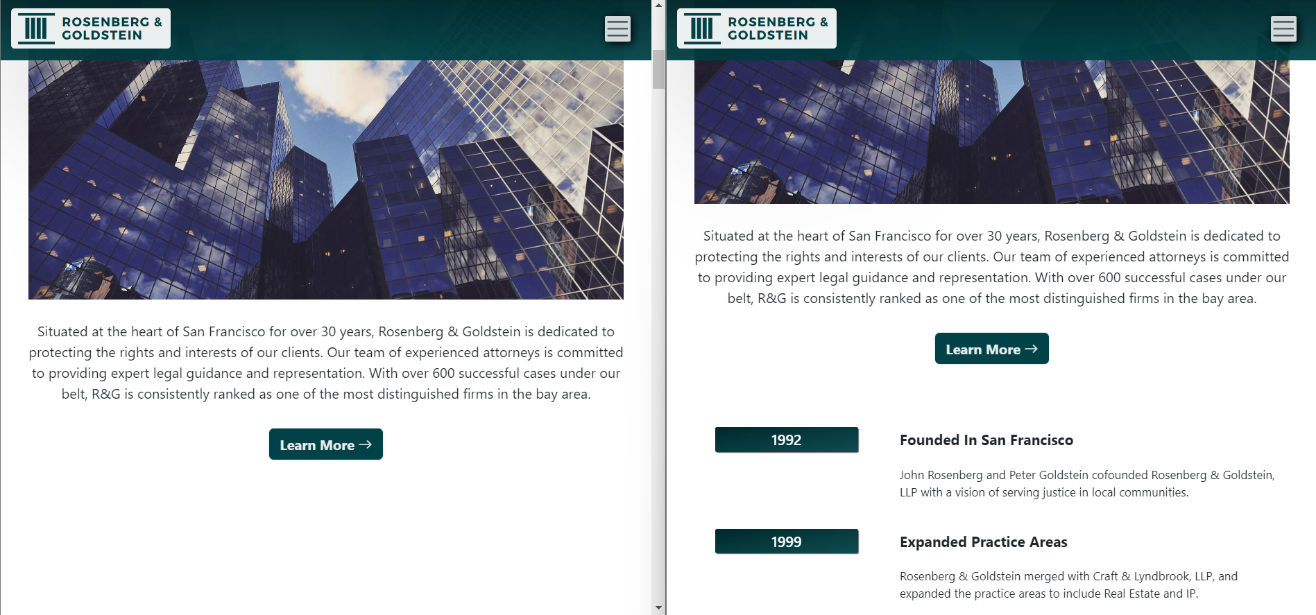
Fading animation is triggered when visitor scrolls down the
website. Select elements that come into view upon scrolling will
fade in.
To implement this feature, a 'fadein' class
with initial 'opacity' value of 0 is created in CSS and added to
the select elements that will fade in. Using jQuery, the
'fadein' class elements will then fade in upon entering the
viewport via scrolling.
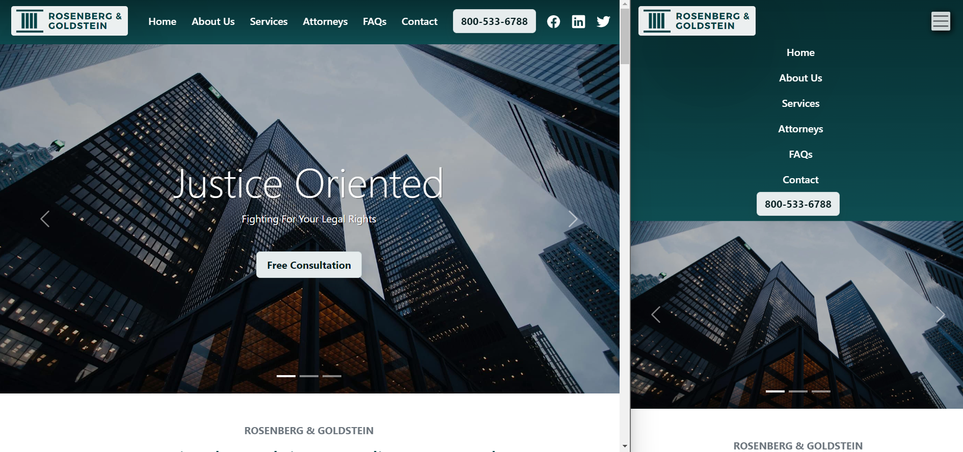
Mobile navigation button will show up on the top right corner
when media query hits mobile navigation width. Mobile menu will
slide in from the top upon clicking the mobile navigation
button.
To collapse the mobile menu, simply click the
mobile navigation button again. Note that by clicking on one of
the nav links on the mobile menu, the mobile menu will
automatically collapse upon jumping to that nav link.
Bootstrap
and jQuery are used to implement this feature.
Rosenberg & Goldstein was designed and built from scratch. Libraries such as Bootstrap and jQuery were utilized to improve development effiency and enhance user experience. Of all the features, developing the form validation algorithm in jQuery was the most enjoyable experience. Below summaries the potential improvements to add to the project in the future:
Consider adding more interative features such as layer animation, audio/video multimedia, slide in Call-to-Action, loading images in sequence, etc. to achieve a more smooth and pleasant user experience.
Consider employing server-side scripting and content management system to build dynamic features such as account database and client case history etc. to develop a more modern and engaging website.